- Description
- Curriculum
- Reviews
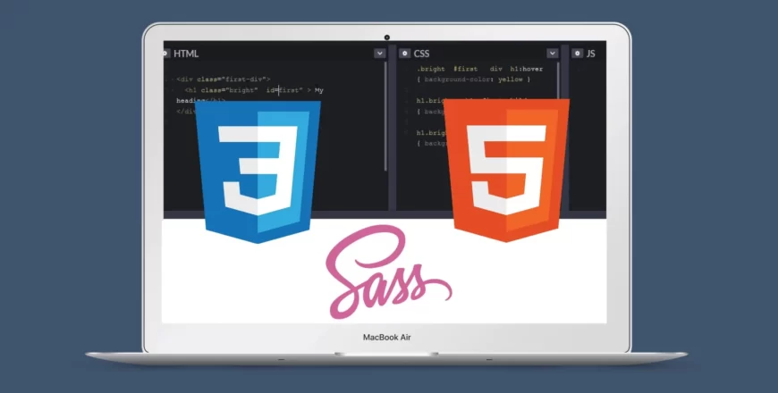
About the Course
An advanced CSS course touching on responsive web design technologies including:
- flexbox
- grid layout
- media queries
And also an inclusion of SASS – Syntactically Awesome Stylesheet.
Objectives
This course is built and structured to make reponsive concepts in easy to grasp.
You will learn to work with:
- flexbox and its properties. Properties that affects the flex container and flex items.
- grid layouts and so many special grid properties to create different layouts and designs.
- media queries, breakpoints and working with different design approaches (mobile-first approach and desktop-first approach).
- SASS technology, its different features that makes it an amazing tool to use for styling and also why you might prefer SASS over standard CSS.
Who the course is for
The course is an advanced CSS course, so some basic knowledge of HTML and CSS is highly recommended. The course focuses more on making designs responsive and so some other properties in CSS might not be totally explained.
-
3
 Box-sizing & developer console
 -
4
Responsive concepts
You can check our this YouTube video to undersand em and rem even better
-
5
Flexbox basics
-
6
Flex-container properties
-
7
Space between items
-
8
Challenge 1
TRY OUT WHAT YOU LEARNED SO FAR.
-
9
Challenge 1 - solution
-
10
Reducing the amount of HTML markup
-
11
Flex-container continuation
-
12
Flex-item properties
-
13
Challenge 2
ANOTHER CHALLENGE TO TRY OUT YOUR FLEXBOX SKILLS.
-
14
Challenge 2 - solution
-
40
Project overview
You can check out this website for the template used in this project and also to check out others you can try out yourself.
-
41
-
42
Styling the header section
-
43
Styling grid section
-
44
Styling the base
-
45
Project conclusion
So I figured out the Javascript issue 😊 I forgot the defer attribute in my <script> tag on the HTML document.
So replace,
<script src="./index.js"></script>with;<script src="./index.js" defer></script>
-
Understanding CSS3 in Web Development
₦9,000
-
Understanding HTML5 Elements, Attributes and Syntaxes
₦6,000
-
What is Prerequisite coursesA prerequisite is a specific course that you must complete before you can take another course at the next grade level.